Advertising design is very important in today’s digital marketing world. A lot of content is fighting for our attention on websites, apps, and social media. Companies need to make ads that stand out and catch the eye. But what really makes good advertising when there is so much information around us?
In this article, I will highlight 11 very creative and unforgettable examples of recent advertising design across different platforms. Looking at these award-winning campaigns gives important lessons for designers and marketers. They show how to create good visuals, clever ideas, and strong messages to reach key business goals like more brand awareness and higher sales
List of Best Advertising Design Examples:
1. Revolution Cooking: Toaster Swatches
2. IKEA: Proudly the Second Best
3. Apple: Display Ad for the Apple TV Gift Card
4. Pepsi: Tastes Ok
5. Sea Shepherd Conservation Society (SSCS): You Are What You Eat
6. McDonalds: Open all night
7. Nintendo: Make The Switch
8. Adobe: Take it Make it
9. Ilyon: Bubbles Empire Champions
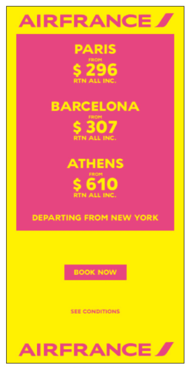
10. AirFrance: Price Offers
11. Mailchimp: A Play On the Brand Name
What Makes Good Advertising Design?
There are several key things that make great advertising design different from average ones. While things like brand consistency in design are important, what really makes an ad stand out is creativity.
The Importance of Good Creativity in Advertising Design
Creative ad design can catch attention, create interest, be simple to understand, and encourage people to act. This creativity shows in different ways:
- Concept– The main idea or message should feel new but still match the brand. Creative ads take a different approach to show product benefits instead of just stating them. For example, IKEA’s “Proudly the Second Best” ad humorously plays with how people see things, showing good ad design with a strong message.
- Copy– The choice of words, message, and tone, set the mood for the visuals. Clever puns, playful words, and chatty language connect better with readers than heavy complicated text. This shows how important the use of text is in effective ad design. Slogans are key takeaways for viewers.
- Visual Identity– A consistent and clear visual style helps brands become easy to recognize. Special fonts, color choices, text style, and repeating design elements like logos create a strong feel across ads, showing good advertising principles. Apple uses clean, aesthetics that make their ads easy to spot.
- Layout and Composition– Ideas like the rule of thirds apply to ads just like in photos. How images, text, space, and sizes are balanced, affects how it’s visual appeal.
- Adaptability– Today’s campaigns often work in several formats like online banners, social videos, or websites. Keeping a solid identity but changing the details for each format is important. For example, Nintendo’s ads kept consistent visuals but adjusted for different formats.
When designers look at award winning ads, they can use the same creative ideas for new campaigns. This way, they don’t have to rely on template solutions.
11 Examples of the Best Advertising Design
Now, let’s look at some great ads made by companies to improve their brand and products.
1. Revolution Cooking: Toaster Swatches
Most toasters usually have just two options – burnt or not burnt. The R180 toaster from Revolution aims to change that. It allows you to toast exactly how you want. The choice is yours!
The idea was clear. There are many shades of pink in the world. Because of this, color swatches could show the different toast settings. This creative plan wanted to get people excited to buy the product, both in stores and online. It aimed to guide them to the Revolution Cooking website for more information.
This promotional effort, called ‘Toaster Swatches’, started in the United States in March 2020. The advertising agency MMB made it for a brand named Revolution Cooking. This effort used print media to show that traditional advertising designs are still important today.

2. IKEA: Proudly the Second Best
This IKEA ad shows parents spending time with their children. In the background, there are some popular IKEA products, like cribs and highchairs. Although the focus remains on the parents and children.
While most ads show products in use, IKEA’s ads focus on their values. They think parents are the most important and that the bond between parents and kids comes first. The ads promote IKEA’s values instead of just wanting to sell more items. This shows that the company knows what is truly important to its customers.
It has clear images and simple details about the products for sale. The branding is not in your face, but it does get its message across.
3. Apple: Display Ad for the Apple TV Gift Card
Apple is well-known for its simple design style. This idea is also used in their display ads, which show the look of their products. The clear graphics and direct language make their ads both appealing and relevant.

4. Pepsi: Tastes Ok
Pepsi and Coca-Cola have been in friendly competition for a long time, but this clever ad really catches the eye. Pepsi, famous for its “Tastes better” slogan, told the story in a new way for this Australian campaign. It suggests that its rival is just “ok”.
In Pepsi’s “Tastes ok” campaign, they used a design error in Coca-Cola’s packaging to suggest its poor quality. This is a smart but risky way to use your rival’s product in your ads. However, when a great marketing opportunity like this is staring you in the face, it becomes a good chance to outdo the competition.

5. Sea Shepherd Conservation Society (SSCS): You Are What You Eat
The amount of plastic waste going into the ocean is huge. It’s difficult to picture how big the problem is. But we can’t ignore it. A German ad company named Ogilvy helps us see this issue. They did a campaign for the Sea Shepherd Conservation Society. This is a group that works to protect ocean animals. The print ad campaign features images of various fish distorted by pieces of plastic, with the tagline ‘You eat what they eat’. The goal of the ads is to inspire people to help clean our oceans by donating to Sea Shepherd.
6. McDonalds: Open all night
This smart ad from McDonald’s was created by the team at Leo Burnett. They kept the McDonald’s style of modern and simple design. The ad is very nice to look at. By using an illustration, they changed the well-known ‘M’ logo into shining lights in the dark. This sends a clear message. It shows that no matter how late it is, McDonald’s is always there to serve you.
7. Nintendo: Make The Switch
Nintendo uses eye-catching graphics and clear, simple language to share their message. The ad focuses on the product and has a direct slogan that clearly conveys what they want to say.

8. Adobe: Take it Make it
Adobe is well-known for its smart marketing. It makes sense because they sell tools for creativity. This company boosts its marketing by being different and creative in their ads. They do more than just show eye-catching images. The text they use also reflects their brand and the purpose of the ad.
A well designed ad is a strong advertising tool. Adobe does very well in both areas.

9. Ilyon: Bubbles Empire Champions
The first three seconds of this Ilyon video ad grab the viewer’s attention. The clear messaging highlights the product well.
It’s important to know that display ads can be more than just still messages. For video ads, it is key to grab your viewers’ attention right away. People scroll through content quickly and have a short attention span. That’s why Ilyon’s ad, made with yellowSTUDIO, works well. It makes the most of the first three seconds. Then, it highlights the product in a clear and simple way, making it stand out more.
10. AirFrance: Price Offers
Air France uses bright colors in their design that catch the user’s eye. The ad gives its message clearly without any text or images that are hard to understand.
Here’s why this display ad works well: The key message of the ad is clear – lower prices for some destinations. But there’s more. Besides its attractive visuals, Airfrance smartly uses Google’s location services to show special deals for certain areas.
The strong colors are hard to miss and really grab the attention of viewers. At the same time, the text shares a clear and straightforward message.
11. Mailchimp: A Play On the Brand Name
Mailchimp, a popular email marketing service, has chosen to improve its advertising approach by adding humor and fun. This new style has worked well for them, helping them stand out from many other companies.
This ad works well because humor is a sure way to grab a viewer’s attention. Mailchimp wisely mixes this with rhyme. This not only sends their message but also makes it stick in the user’s mind. They have a clear message with clever text design. The overall look feels good, thanks to a calming pastel color theme used throughout.
Diving Into the Process: How Great Ad Designs Are Born
Creativity and attention to detail make great advertising design. To reach that level, you need smart planning and a step-by-step way of doing things. Let’s look at some key parts of the advertising design process that helps explain how great ads are made.
The Initial Brainstorming Phase: Getting Creative
The idea for great ad design usually starts in teamwork meetings. Agencies bring together different experts like copywriters, art directors, designers, and strategists to come up with ideas. They focus on the brand’s goals, target audience, and other key factors.
Sessions use creative thinking methods. These methods involve listing unusual comparisons, imagining future ways of living, and changing our assumptions. This helps create a starting set of ideas. In this stage, we have the freedom to explore ideas without any restrictions – no idea is bad. The goals, main messages, styles, and possible visuals come from our shared thoughts.
From Sketch to Final Product: The Design Process
With a clear plan in place, the design process begins to turn ideas into real life. It starts with drawing rough sketches that show different arrangements. Art directors first create quick drawings before spending time on final digital layouts and presentations.
Design goes through reviews with stakeholders. It tests ideas with focus groups and improve messaging. This way, the final product fits brand guidelines and goals. For digital and video, animation storyboards show how interactive concepts move. The journey from sketches to the final, polished design takes constant improvement and testing.
Working with a Design Team vs Going In-House
Brands can choose to rely on an outside creative agency or create their own marketing design teams. Outside agencies offer new ideas, expert skills, and the ability to manage big projects. But they can also be more expensive and cause problems with staying consistent after a project ends.
Internal marketing teams know the details of the brand and how it works. This helps them to keep a consistent design over time. However, they may face limits when there are bigger projects or if they lack different skills. To get better results, it is important to think about these factors when choosing between using outside help or sticking with inside resources.
The process of turning early ideas into a complete design needs a lot of teamwork, testing, and refining. Knowing how this works helps set clear expectations for creating great and creative ads.
The Role of Print Ads in the Digital Age
Digital channels now allow for more focused and measurable advertising. However, print still has special benefits for branding. Knowing today’s smart ways to design in print helps it stay important for campaigns.
Why Print Ads Still Matter: A Look at Effective Design
Though some say print ads are old-fashioned, they can be very effective if done right. Full-page ads in magazines grab attention and make strong impressions. A good layout with space, colors, and text styles helps readers follow the message. Also, readers typically spend more time on print ads, thinking about the information instead of just quickly glancing through digital content.
Brands like Apple still spend a lot of money on print ads. Their 2015 Shot on iPhone series showed amazing product photos. It helped guide readers with text on a simple white background. This use of print helped pay more attention to the details.
Creating an Ad That Stands Out in Print Magazines
While digital banners fight for attention in packed feeds, print ads only sit next to text content. This gives a stronger visual impact if you follow main design rules:
- Use different colors and shapes to guide the eye where to focus.
- Line up text and graphics with hidden grid lines.
- Make key images bigger for a strong effect.
- Add white space and borders to highlight important messages.
Epica award winner, Mint Velvet used big product images to grab attention in magazine pages that had little text.
Combining Print and Digital: A New Strategy
Print has strengths in storytelling. These works well with the ability of digital media to get quick responses. This creates a strategy that uses both forms. QR codes can lead people to online sites. At the same time, print ads can grab attention at first.
Augmented reality links the physical world with the digital world. It creates fun experiences when you scan print ads. A good example is Lidl’s fruit AR project. It helps bring healthy recipes to life using mobile cameras.
While print design needs to adjust to a smaller market, it still has a strong effect for lasting messages and campaigns.
The Wrap Up
As we finish looking at these great advertising designs, we see that creativity, planning, and a smart use of design rules are important. Brands like Revolution Cooking, IKEA, and Apple have gone beyond what’s usual. They use eye-catching visuals, interesting design features, and clear messages to connect well with their audiences and stand out from the rest.
From how Apple uses print media to how Nintendo runs digital campaigns, there are clear examples of how good ads help with brand recognition and customer connection. These brands show us several key lessons. First, keeping a consistent brand image is important. Second, using space well around images matters. Third, delivering strong messages is crucial. Lastly, it’s vital to have the courage to think differently.
Bottom line, good advertising designs are not just about looks. They also need to send strong messages that make people act. Whether you are a design team or a designer inside a company, these inspiring trends, practices, and examples can help you create advertisements that stick and make an impact.


